Wednesday 27 September 2017

BASIC REPEATER (How to load data in repeater)

REPEATER WIDGET 

Repeater widget is used to display repeating patterns of text and images.widgets contains in several states which are then switched between, repeaters contain one set of widgets—called the "item"

Item - The collection of widgets being repeated is called the item.
which is then iterated several times. Each iteration of the item is different, and the differences are controlled by data loaded into the repeater's "dataset".When you open a repeater for editing, the item is displayed on the canvas.

DataSet - The appearance and behavior of a repeater is driven by the data in its dataset.The dataset can be seen in the Inspector's Properties tab. You can add new columns and rows or delete existing ones. Cells of the dataset can contain text, images, and references to pages in the project. To add an image, right-click a cell and choose "Import Image". To add a reference page, right-click a cell, click "Reference page", and then choose a page from the resulting dialog.


How to use Repeater Widget to load text,images (Follow the steps)

Step 1 - From Libraries place the Repeater in Canvas and name the repeater.


Step 2 - Click on Repeater cell and name it , and make some more cell as you required. 


Step 3 - click on home tab - now repeater looks like as you placed more cell as same 


Step 4 - In Properties Repeater Panel - options like add Column and Row as well as fill the data


Step 5 - Fill the Repeater Panel as table set the column name i.e "item" like i have fill it as Name Description Price Image. and related column as well.


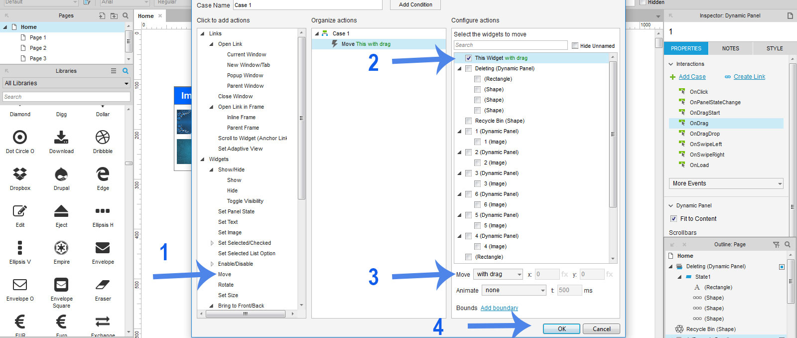
Step 6 - Click on case 1 which is already available and set the rule in case editor.


Step 7 - Click to add actions -> Widgets -> Set Text

Configure actions -> Checked to Description.

Right Below "Set Text to" click on "fx" to set the rules 


Step 8 - While click on "fx" it will open new window Edit Text where click on the link "Insert Variable / Functions" DropDown will appear where select "Item.Description" and click OK


Step 9 - Now Set Image to Values From Click to add actions -> Widgets -> Set Image

From Configure actions -> Checked to > Set Image , below select from dropdown Value and click on "fx"


Step 10 - Now same as above step after click on "fx" select "Item.Image" and click on OK


Step 11 - Now set the Price as text and follow the same step as description.


Step 12 - Now Click on Repeater any cell and go for editing the cell height , width and place it aligned way to look


Step 13 - After aligned the cell see the Repeater and Preview


Step 14 - Now Style the cell as required like border - None, Name cell as Bold.


Step 15 - Change the Layout vertical, checked wrap grid, item per row 2


Step 16 - After change in Layout style see the Preview 


Step 17 - Now Import images in "Repeater Panel" right click on img cell and import the image.

Note*- the image width height will be same as you have done in repeater.


Step 18 - Preview (All text, images are loaded)


Thanks.

Tuesday 26 September 2017

Scrollable Table

How to create Scrollable Table using Axure RP

Step - 1 - Place the box 1 shape and make the table header


Step - 2 - Place the Table from Libraries, add column to left of the table and make column as per table header created above. 


Step - 3 - Fill all column of table and "Convert to Dynamic Panel"


Step - 4 - Select the Dynamic Panel and in properties block "Scrollbars" dropdown menu -> select "Vertical as Needed"


Step - 5 -  Now make the table height less/small 


Step - 6 -  Preview in web browser .


Thanks.


Drag and Drop

How to create Drag and Drop in Axure RP

Step - 1 -  From Libraries place the boxes, heading and create two Boxes for image container and Drag and Drop in Recycle.


Step -2 -   Place images in Image container box and name all images


Step - 3 - Place Recycle bin image in 2nd Box and name it as "Recycle bin" 


Step - 4 - Now Create deleting image looks like it is in Processing (means deleting image)


Step - 5 - Select all Deleting elements and Convert to Dynamic Panel and "Set Hidden"


Step - 6 -  Now select each image one by one and convert to Dynamic Panel


Step -7 - Select image 1 and in Properties tab double click on "OnDrag" to Add Case


Step - 8 - Now in Add Case window Follow Below Image Steps


Step - 9 - Select image 1 and in Properties tab double click on "OnDragStart" to Add Case


Step - 10 -Now in Add Case window Follow Below Image Steps


Step -11 - Select image 1 and in Properties tab double click on "OnDragDrop" to Add Case


Step - 12 - Now in Add Case window Follow Below Image Steps ( Click on the Add Condition Button )


Step -13 - Condition Builder window will open, Please follow below image steps.


Step - 14 - After Condition Builder Please follow below image steps.


Step - 15 - Please follow below image steps.


Step - 16 - Follow the Same Process with all images as done above.

Step - 17 - Now Preview 


Step - 18 - See in Web Browser


Thanks.


Monday 25 September 2017

LightBox / Pop up

How to Create Lightbox using Axure RP

Step - 1 -  From Libraries select box, image, paragraph and Button, Place it . and make block


Step - 2 -  From Libraries select box, image, paragraph place it and select all second box and 

"convert to Dynamic Panel".


Step - 3 - After convert to Dynamic Panel  select "Set Hidden"


Step - 4 - Select "Pin to Browser"


Step - 5 - Follow to below image Steps to make the center align to the browser.


Step - 6 - Select the button and in Properties double click on "OnClick" and Add Case


Step - 7 -  In Add Case Window 

a> Click to add actions -> Widgets -> Show / Hide

b> Configure actions -> Checked Dynamic Panel

c> Visibility -> Show

d> More Option dropdown select -> treat as lightbox

e> Press Ok


Step - 8 - Now Preview 


Step - 9 - Preview in Web Browser ...

Click on Button "View complete News"

Lightbox will open to close the lightbox click outside the complete news box, it will close.


Thanks.