Friday, 22 September 2017

TAB CONTROL Using Axure RP 8

How to create Tab Control using Axure RP 8

Step - 1 - First open New file in Axure RP 8
Step-2 -  From Libraries select Rectangle shape and set height and width as per given below image


Step - 3 -  From Libraries select Heading H1 and horizontal line


Step - 4 - From Libraries select Image (double click the image to change image from computer) and select the Paragraph and Place near to image (as aligned way).


Step - 5 - Select all (rectangle,image,heading,paragraph) and right click and select "Convert to Dynamic Panel"


Step - 6 - Converted to Dynamic Panel now Name it as "Tab_Content"


Step - 7 - After converting to Dynamic Panel "Outline Page " see there is State, now Right click  on State and select Duplicate State and do twice, Now you have State 1 , State 2 , State 3.
Leave the State 1 as it is . next step you have to click on State 2 and State 3 and Edit the Content.


Step - 8 - Click on State 2 , it will open in new tab and Edit the content and image


You can set the Font color, Background color, font-size, font-style as per below image.


Step - 9 - Now From Libraries select the Rectangle shape and make it small size (looks like tab), make it 3 because we have 3 states.


Step -10 - Select each tab Rectangle and Name it as Tab 1,2,3 respectively.


Step - 11 - Select all tab (rectangle) and Right Click and select the "Selection Group"


Step - 12 - Name the Selection Group as Tab_Control


Step - 13 - Now Name to each Rectangle (tab)


Step - 14 - Select all rectangle (tab) and Right Click  select "Interaction Styles"


Step - 15 - In Interaction Style Window select "MouseOver" Tab and checked to Fill color and Pick the color 


Step - 16 - In Interaction Style Window select "Selected" Tab and checked to Fill color and Pick the color 


Step - 17 -  Select each Rectangle (Tab) and Inspector : Page - Properties "double click" on OnClick and Add case


Step - 18 - In Case Editor 

> Click to add actions > Widgets > Set Panel State , Configure actions > checked the set Tab_content , Selected State > State 1 , animation In > none , animation Out > none , Press OK


Step - 19 - In the same case Editor 

> Click to add actions > Widgets > Set Selected/Checked , Configure actions > checked the Tab 1(rectangle) , Set selected state to , Value > true , Press OK


Step - 20 - do the same process in reaming two more tab

Step - 21 - Now all tab having actions . Now Preview.


Step -22 - Preview in Web Browser


Thanks.


Thursday, 21 September 2017

Content Slider / Carousel Using Axure RP 8

How to create Content Slider using Axure RP 8

Step - 1 - Open New file - From Libraries select Rectangle and set width and height as per                            below image


Step -2 - From Libraries select H1, H3 and place in  Rectangle  and Edit the Text


Step - 3 -  Select the text and change font color and font-size as per below image


Step - 4 -   Select All element and right click and select to convert to Dynamic Panel


Step - 5 - After converting to Dynamic Panel  and Name the Dynamic Panel as Content-Slider
                 see - Outline : Page there State is created 
                Now create 2 duplicate State .


Step - 6 - Now click on State 2 it will open in new Tab, and Edit the text in the Rectangle and do the same with State 3 also.


Step -7 - Come Back to home Tab


Step - 8 - From Libraries Select the Rectangle Shape and Resize the Rectangle shape to Small, and create the 2 more same shape and make it centered align.


Step - 9 - Select All rectangle Shape and right click and click on Selection Group


Step -10 - Name the Selection Group as Controls


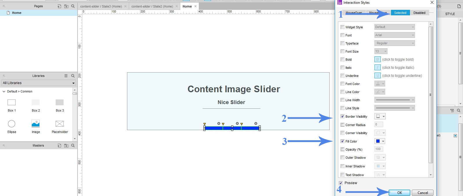
Step - 11 - Again Select all rectangle Shape and right click and select Interaction Styles


Step - 12 - In Interaction Styles window Select MouseOver Tab and checked Fill color and Border


Step - 13 - In Interaction Styles Select the Selected Tab and checked Fill color and Border


Step - 14 - Name each Rectangle as Control 1, 2,3 respectively.


Step - 15 - Click on 1st Rectangle and double click on "OnClick" and next step to add case


Step - 16 - In Add Case 

"Click to add actions - widgets -> Set Selected / Checked"

"Configure actions -> checked -> Control 1"

"Set Selected state to -> Value - True"

"Press - OK"


Step - 17 - In Add Case

"Click to add actions - widgets -> Set Panel State"

"Configure actions -> checked -> Set Content Slider "

"Selected state - State 1"
"Animation In - Slide left" "t - 500 ms"
"Animation Out - Fade" "t - 500 ms"

Press -OK


Step -18 - preview


Step -19 - See in Web Browser


Thanks.


Wednesday, 20 September 2017

Image Slider / carousel Using Axure RP 8

How to create Image Slider using Axure RP 8

Step-1 -  Open Axure File New


Step-2 - From libraries select Rectangle shape and drag  (Follow below image mention by 1,2,3).
               set the height and width of rectangle as required.


Step-3 -   select image From libraries and place in the rectangle.


Step-4 -  Right click on image and select the import image.


Step-5 - Place image from your computer


Step-6 - Select Both image and rectangle then right click  and convert to Dynamic Panel.


Step-7 - After converting dynamic Panel name it as "image-slider" 
              In outline Page "Right click on State" and select Duplicate state and make 2 duplicate state. 


Step-8 - As per below image added 2 duplicate state and it is name as State 2 and State 3


Step-9 -  Now click on State 2 Image in "Outline Page" it will open the image in new tab .
click on image / double click the image and change the image from computer as 2nd image.


Step-10 - Same step follow for State 3 image also. (change the image from computer)

Step-11 - Select Ellipse from libraries and keep three ellipse below the image for controls


Step-12 - Select all ellipse and "Right click and select" <Selection Group>


Step-13 - Name the Selection group as controls


Step-14 -  Again Select all ellipse and right click and Select "Interaction Styles"


Step-15 - While click on "Interaction Styles" the window will open as below image.
                 In Interaction Styles window select "MouseOver" Tab and select "Fill Color" and pick the color from color picker.


Step-16 - In the same Interaction styles window Select "Selected Tab" and select Fill color and Pick the color from color picker.


Step-17 - Now Name the each Ellipse as control 1, 2, 3 respectively. as mention below image


Step-18 - Select Ellipse 1 and in Properties panel double click on "OnClick" / Add case

Will get below window as "Case Editor"

a.> In Left side click to add actions click on "Set Selected/Checked"

b.>In right side checked "Control 1 ellipse"

c.>  Right side below block "Set Selected State to" Value - true.


Step-19 -  In same case Editor 

                 Left side click "Set Panel State"

                 Right side "Checked" set image slider as dynamic panel

                 Right side below panel "Select State - State 1" , Animation In - Slide-left, t- 500ms

                 Animation Out - Fade, t-500ms

And Press OK


Step-20 - Follow the Same Step-19 for remaining State 2 and State 3

Step-21 - Preview (see in web browser)


Step-22 - Final Result (click on bullet (ellipse) see the image is sliding and bullet color is change 


Thanks.